Source: Arthur & Passini
Let’s say you own a retail store and are designing a new sign for the exterior of your building, what colours would you use? Signage, especially when viewed from a distance, requires some careful design considerations. One must scrutinize the amount of information, type of imagery, size of fonts and colours used. Unlike posters or print advertisements, signs demand simplicity and clarity. The colour of your font/s and the colour/s that they sit on is paramount to the legibility of your store’s signage. In 1992, Arthur and Passini created a guide to help designers produce effective wayfinding systems. Thirty years later, this guide is still in use.
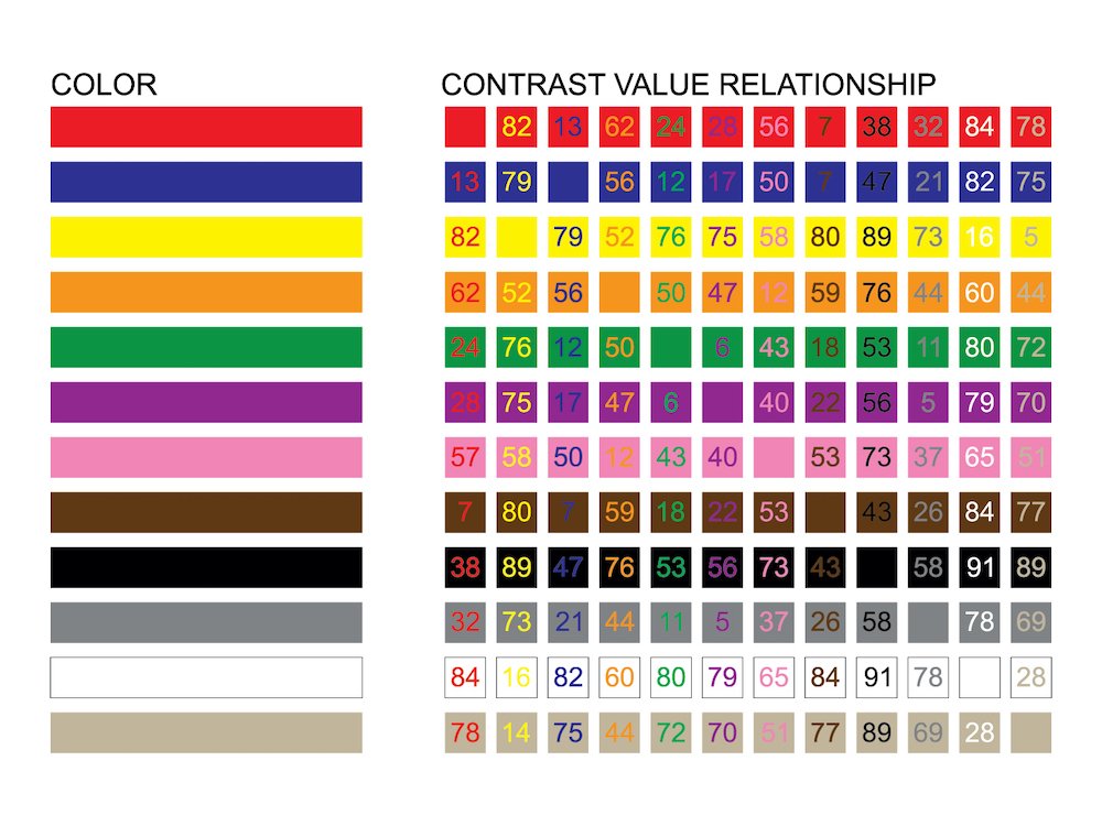
Their guide includes the chart that you see here. By focusing on the 12 most popular colours (red, blue, yellow, orange, green, purple, pink, brown, black, white, grey and beige), they developed a matrix that shows all possible pairings within that grouping. Printed inside each square is a number score (out of one hundred) that grades the light reflectancy readings of a particular colour combination. The higher the score, the more discernable the inside colour is from its accompanying background colour. Their findings found that a score of 70 or higher assured good legibility. In other words, the chart establishes which pairings provide the best colour contrast to the viewer. Note that the two highest scores involve combinations of white and black. Imagine looking at the two exterior signs shown below from two blocks away. The one on the left is very clear, the one on the right, less so.
