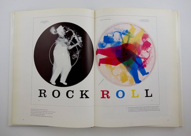
In 1955, the remarkable trade book Color by Overprinting came on the scene. I say remarkable because it may be one of the most interesting instructional books about colour ever produced.
It's a guide book for designers and printers on how to make additional colours by overprinting inks. In other words, when colour A overprints colour B the result is colour C. As the book’s introduction points out, “Few printers at this writing, and fewer artists, realize that by printing three solid colors, seven will appear on the printed surface if they are properly arranged, or that by adding a fourth basic to the overprinted inks, fifteen separate and distinct solid colors may be produced.”


Graphic design greats, like Americans Massimo Vignelli & Bradbury Thompson and Werner Zryd of Switzerland, took advantage of this process of creating new and, at times, unexpected colours. A full three decades before the personal computer revolutionized the way designers worked, the use of colour overlaying added a visual sophistication never seen before in the graphic arts.

Massimo Vignelli / 1967
Bradbury Thompson / 1958

Werner Zryd / 1955