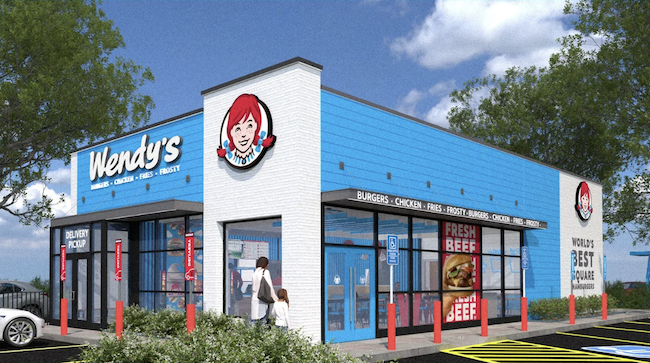
In an attempt to differentiate themselves from their competitors, Wendy's has introduced its "Future Fresh" initiative. New restaurant designs are part of this change, designs that move away from the colour red and embrace blue (the cyan borrowed from the ribbon in Wendy's pigtails). With this dramatic shift, Wendy’s is embarking on a bold venture. A risky one too.
Red has proven to be the best colour to attract people’s attention, especially when used in signage and packaging. It also increases your appetite, that’s why it’s so popular in the fast food sector – think McDonalds, Pizza Hut, KFC and Dairy Queen. Conversely, blue represses hunger and is seldom associated with restaurants or food packaging. To complicate matters, most people don't even associate blue with eating. Beyond blueberries, grapes and plums, very few foods are naturally blue in colour. I bet you're hard-pressed to name another example. For consumers, blue is more closely associated with cleaning and hygiene products.
In order to remain competitive and fresh, Wendy’s is betting on the colour blue. Let’s see if this turns out to be money well spent.