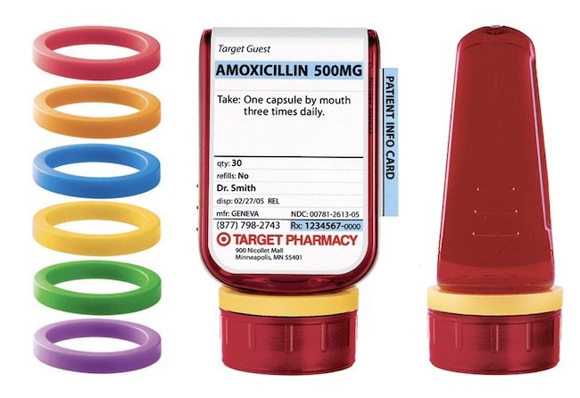
While at art school, Deborah Adler was confronted with a dilemma. She learned that her grandmother had mistakenly taken medication meant for her grandfather. They each had pills in their medicine cabinet, and all of the pill bottles were identical — that ubiquitous orange plastic container. Adler saw this as a design problem and set out to develop an improved bottle to help prevent similar mistakes. After years of making prototypes and refining designs, Target launched her product under the name: Clear RX System.
This innovative system included a new bottle shape and revised label design. Adler developed a logical hierarchy for the information on the label and presented it in a clear, easy-to-read typeface. Most importantly, she introduced colour-coded rings that fit around the neck of the bottles, allowing each prescription a distinct identifier.
The Clear RX System was an instant hit. In 2010, the Industrial Designers Society of America awarded it the “Design of the Decade.” However, in 2015, CVS Health purchased Target’s in-store pharmacy and, for reasons unknown, discontinued the Clear Rx System. This was likely a financial decision. So, it’s back to the problematic orange bottles and the potential for more mix-ups.

