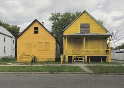
In 2015, artist and architect Amanda Williams, an adjunct professor of architecture at the Illinois Institute of Design, painted the exteriors of eight different south-side Chicago buildings. It was part of her investigation into the relationship between colour, black culture and urban blight. Williams chose colours that hold strong associations to specific products and services found in the local African American community. Here are the colours she chose and the names she gave them:
> Oil Moisturizer pink
> Ultrasheen blue
> Harold’s Chicken Shack red
> Currency Exchange yellow
> Safe Passage yellow
> Newport Squares teal
> Crown Royal purple
> Flamin’ Hot Cheetos orange
The project Color(ed) Theory involved a group of abandoned structures scheduled for demolition. Williams explains that “architecture in certain neighborhoods is marked by a process of removal, not addition.” This conceptual work of art heightens the viewers awareness of the power of colour associations, using them to draw attention to a community's need to maintain its identity. “The idea of taking colors that were familiar to a certain audience and de-contextualizing them outside of their commercial use and fitting them into isolated residential situations, presented a lot of questions,” says Williams. Colours not only trigger strong memories, they creates new and meaningful correlations.