Since it was first introduced in 2000, the colour of the year has included Radiant Orchid, Living Coral and Tangerine Tango. All captivating names. All easy on the eyes. But how does a particular colour rise above the others to warrant top billing? And who makes a decision like this?
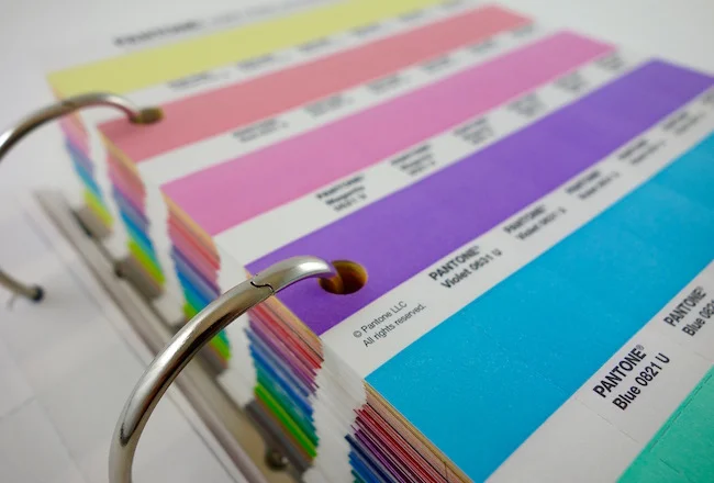
Officially, it is referred to as the Pantone Color of the Year, named after the U.S. firm that is responsible for determining and promoting the yearly selection. The Pantone Matching System (PMS) is the premier source for designers to maintain colour consistency in its various forms of reproduction – be it printing inks, paints, dyes, etc. PMS colour standards provide an invaluable source for many professions, including graphic design, industrial design, automotive design, fashion and home furnishings. As well as conducting extensive testing and research, Pantone update their library of colours every two and half years.
Choosing the colour of the year is an extremely involved process. Consultants travel the world to visit major centres like London, Paris and Milan to keep their finger on the fashion pulse. They report on new colour directions showing up on the runways. All the while, motion pictures, the art world and new technologies are scrutinized for clues to rising trends. And let’s not forget flora and fauna. Nature provides, what seems to be, an infinite supply of colour variations and combinations. Notes, photographs, interviews and constant observation inform the selection committee’s investigation. In the end, the colour of the year may not resonate with you personally, but you can be sure a thorough and adventurous journey led to the final outcome.